I increased production at scale without impacting SLAs by using my design expertise to inform the development of a proof-of-concept resulting in 100x creative output for optimization with MAB testing and machine learning.
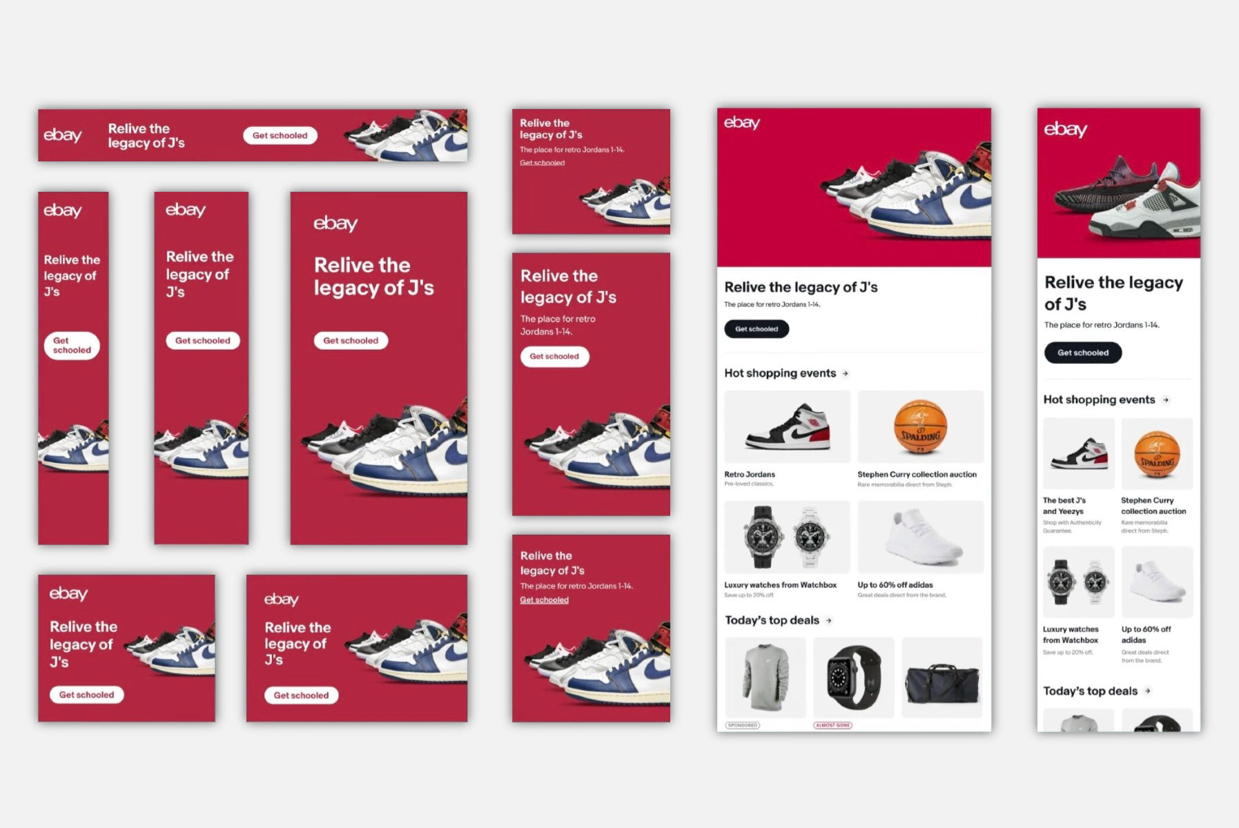
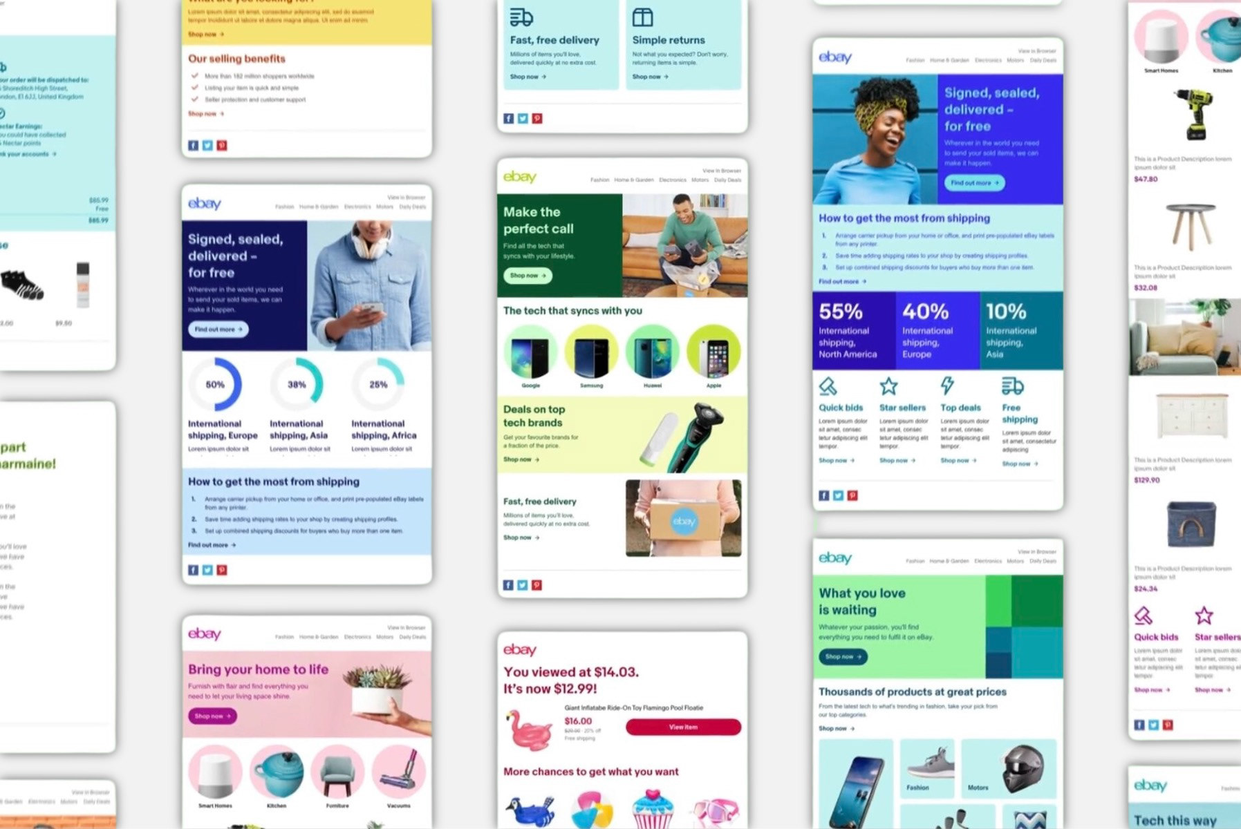
The Creative Generator utilized three seed elements: copy, color, and images. These combine for reusable assets across multiple channels, including variables for optimization. Seed elements could be constrained or unconstrained with guardrails based on the objective. Any or all seed elements could be used as a multiplier to meet or surpass the hundreds of variations needed for analysis.
With our success, eBay adopted the proof of concept in-house. A dedicated team was established, including a PO, UX designer, engineers, and additional technical staff to integrate the tool into a larger platform called the Unified Experience.
With our success, eBay adopted the proof of concept in-house. A dedicated team was established, including a PO, UX designer, engineers, and additional technical staff to integrate the tool into a larger platform called the Unified Experience.
Seed elements
• Copy: Small, medium, and large versions to fit a variety of channels. Copy for tonal modulation between captivating, considerate, and straightforward
• Color: Semi-automated color picker based on a dominant and accent selection for color layering (color on color) and color blocking (color next to color)
• Images: Dynamic cropping and focal point detection for multiple aspect ratios
• Color: Semi-automated color picker based on a dominant and accent selection for color layering (color on color) and color blocking (color next to color)
• Images: Dynamic cropping and focal point detection for multiple aspect ratios
Color picker
We built an automated method for picking colors in addition to the manual process.
• First, colors are extracted from uploaded images and ranked according to percent of use.
• The hex values are then compared to an array of brand-approved colors.
• Once identified, the dominant brand color runs through the same method as the manual process.
• Rules are in place for sufficient contrast for accessibility for color on color and color next to color. The logic includes monochromatic and neighboring color schemes with an order of tints and shades for a given hue.
Content-aware, focal point image cropping
We included functionality for dynamic cropping to account for multiple aspect ratios. Crops for extreme image sizes are successful in scaling a single image across most placements.
These include:
• Long and narrow landscape images used for leaderboards
• Tall and narrow portrait images used for skyscrapers
• Nearly square images are used for MREC
• The largest rectangular image used on the homepage
• Long and narrow landscape images used for leaderboards
• Tall and narrow portrait images used for skyscrapers
• Nearly square images are used for MREC
• The largest rectangular image used on the homepage
