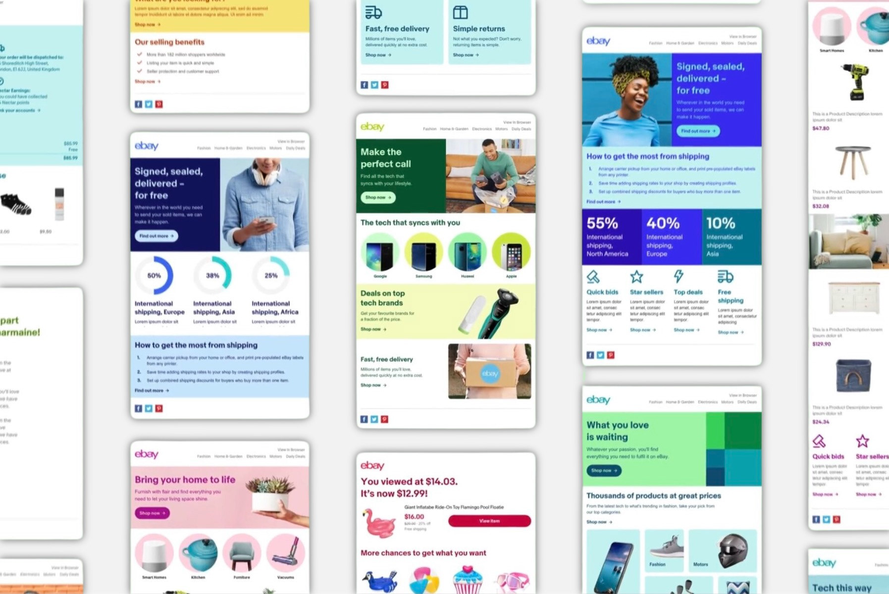
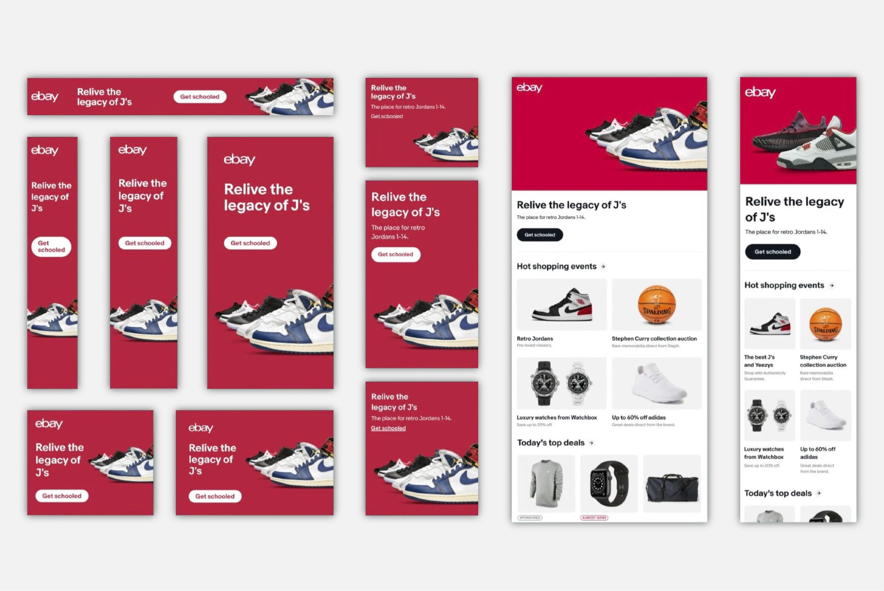
II designed eBay's flagship buyer email that uses personalized recommendations and conversion tactics for new and existing purchase journeys. It generated $327 million in GMB in 2020.
eBay is a big marketplace which can sometimes be overwhelming to navigate. This personalized email, codename Espresso, helps by doing the tedious work of search and discovery so a customer can peruse results tailored to their interests based on site activity and purchase history.
eBay is a big marketplace which can sometimes be overwhelming to navigate. This personalized email, codename Espresso, helps by doing the tedious work of search and discovery so a customer can peruse results tailored to their interests based on site activity and purchase history.
Espresso originated in 2014 as an email to promote Limited-time Sales and Events. We added additional content types over time. Once it became multiple types of email, we looked at the competitive landscape to classify each section leading to an update in the wireframe and type ramp to drive consistency through the variety of content.
We wanted to scale the email to a larger audience across regions. A human effort was undertaken to curate content from eBay so that we could determine what the machine needed to consider. Based on audience insights from the brand, four personas were created that represented aspects of Self-Expressionist and Treasure Hunters. This showed how the same framework could be a tailored experience for each person’s customer journey.
In addition to determining what would be shown next, based on site behavior, we leveraged additional inputs that weren’t tied to purchase intent. We conducted research in US, UK, and DE with eBay customers to understand the relevance of existing modules and content and to discover new content that users would like to see.
In addition to determining what would be shown next, based on site behavior, we leveraged additional inputs that weren’t tied to purchase intent. We conducted research in US, UK, and DE with eBay customers to understand the relevance of existing modules and content and to discover new content that users would like to see.
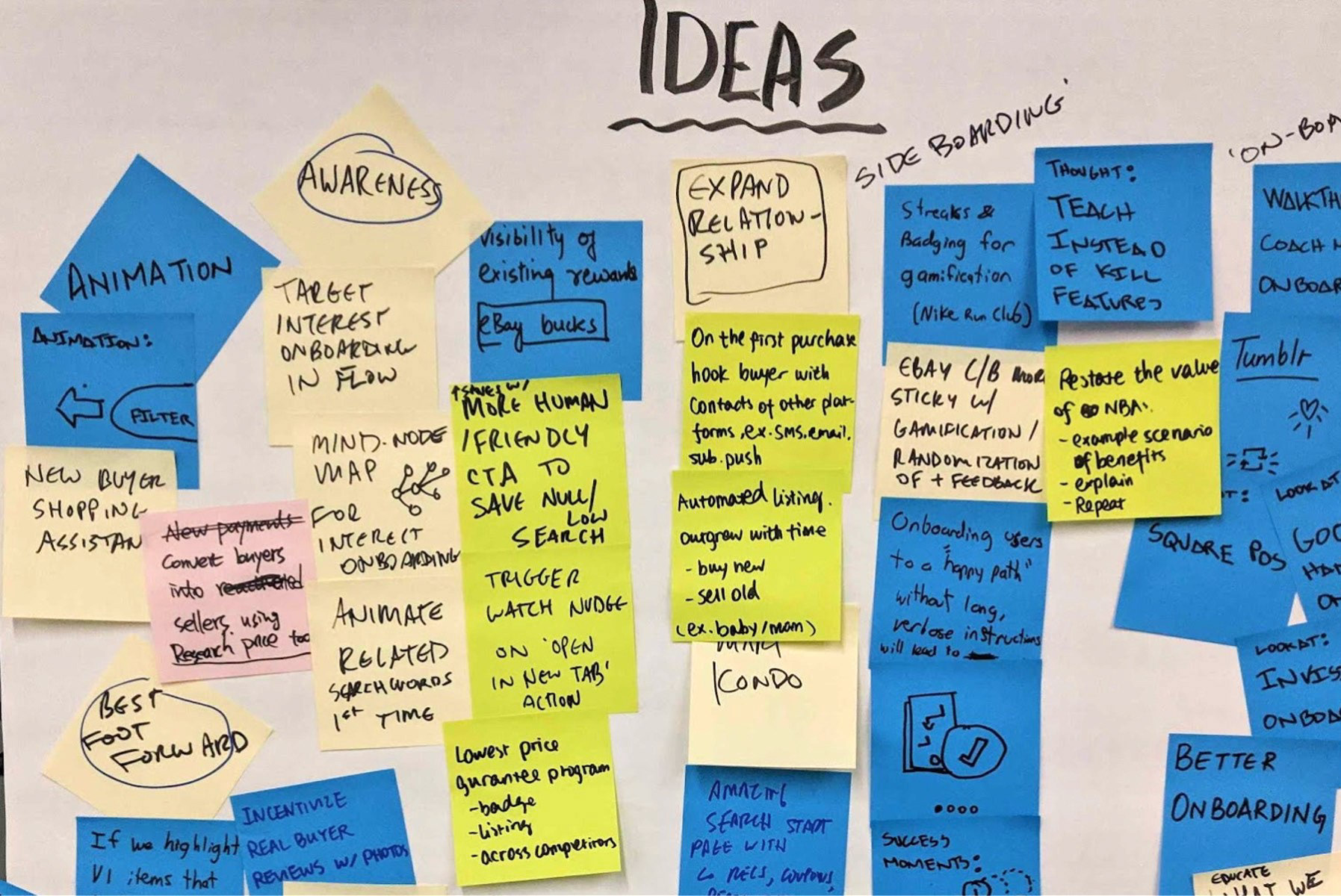
In 2016, we created a vision deck that included ideas such as a dashboard with anchor links, using a card-based design system, content level explicit feedback (like/dislike), add-to-cart functionality, additional personalization, and a daily theme strategy.
In 2018, the email moved from single channel to multi-channel. We redesigned the wireframe to mimic the homepage with three banner placements: top, middle, and bottom. We replaced single-item/single-click cards with 4-item recommendations. These changes enabled channel parity and content to be consumed dynamically from the on-site experience.
Additionally, we enabled a flexible layout for reordering modules. This change accomplished two things; it kept the content fresh since the email was sent daily and allowed an additional layer of personalization. If you didn’t have enough activity to populate a set of item recommendations, we could easily replace the suggestion type. Perhaps you browsed less than three items in the past month, but you did make a purchase. Since you didn’t qualify for Recently Viewed Items to promote an existing purchase journey, we could replace it with Similar Items based on your last purchase to encourage a new purchase journey.
Additionally, we enabled a flexible layout for reordering modules. This change accomplished two things; it kept the content fresh since the email was sent daily and allowed an additional layer of personalization. If you didn’t have enough activity to populate a set of item recommendations, we could easily replace the suggestion type. Perhaps you browsed less than three items in the past month, but you did make a purchase. Since you didn’t qualify for Recently Viewed Items to promote an existing purchase journey, we could replace it with Similar Items based on your last purchase to encourage a new purchase journey.
Today Espresso is evolving again. Tests are running on the Unified Experience Platform as a blended canvas with a conversion email called Purchase Assistant. Content from both emails can be combined or suppressed based on Customer Science models.

